Azure Charts: A Visual Guide to the Microsoft Azure Cloud
As a Lead Technical Architect, I often use Azure Charts in my daily work. Undoubtedly, it is a fascinating tool that brings incredible clarity to the cloud. Specifically, Alexey Polkovnikov, a Microsoft Cloud Solution Architect, created this brilliant platform.
Essentially, it acts as a live visual exploration environment for the Azure Cloud and its ecosystem. Furthermore, the cloud representation metrics are auto-updated continuously. Consequently, this provides real-time insights into the current state of various Azure services.
Key Features and Benefits
Overall, this platform offers several distinct advantages for professionals:
- Data-driven insights: Firstly, you can explore trends, usage patterns, and market share information. Specifically, this data relates directly to Azure and its various services.
- Independent perspective: Secondly, you gain valuable insights from a unique project. Indeed, a deep passion for the Azure community drives this initiative entirely.
- Visual clarity: Thirdly, it helps you understand highly complex data points. Consequently, you can interpret information easily through intuitive charts and graphs.
Explore Azure Charts and uncover the data behind the Azure ecosystem: https://azurecharts.com/
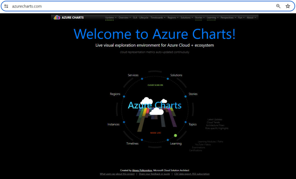
What can you do with Azure Charts?
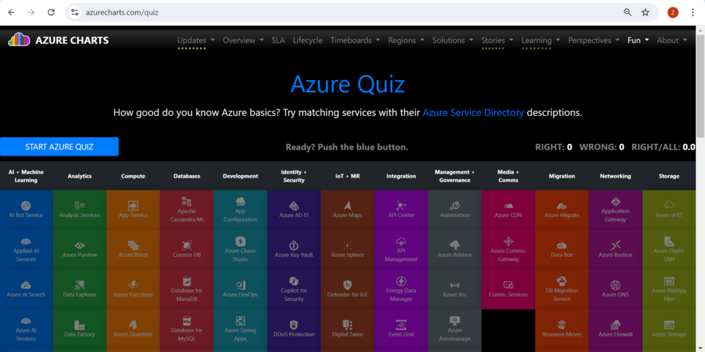
Primarily, this interactive dashboard offers a comprehensive overview of Azure Services. For instance, you can explore vast arrays of categories ranging from AI and Machine Learning to Analytics, Compute, and Databases.
However, the tool is not just about merely viewing data. Instead, it is about truly understanding it. With this environment, you can compare geographical regions easily. Additionally, you can view aggregated presence metrics. Ultimately, you can even explore sovereign and Stack instances.
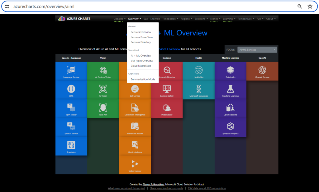
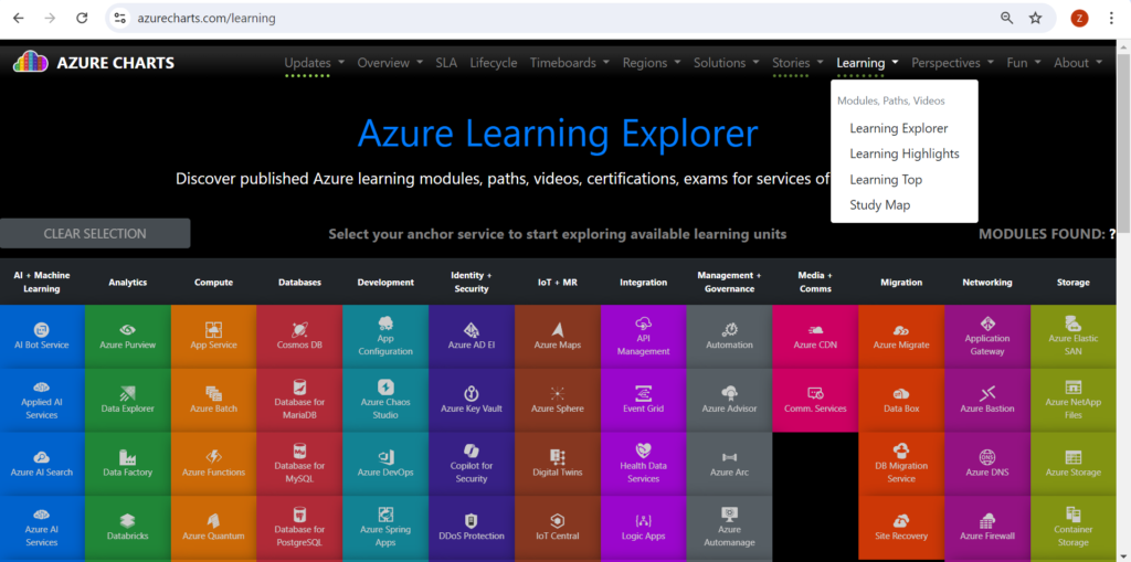
Learning with Azure Charts
Moreover, this dashboard is much more than just a simple visualization tool. In fact, it’s a learning platform. It helps you understand what Azure consists of and how it evolves. To aid in focused learning and staying up-to-date, Azure Charts offers a suite of interactive charts under the Learning menu.
Integration with Azure DevOps
Additionally, the platform extends its functionality directly into Azure DevOps. Therefore, you can quickly view the status of work in progress. Specifically, you achieve this by charting the results of a flat-list query. Different chart views such as pie, column, pivot, or trend are supported. This allows for a count of work items or a sum of values for select numeric fields, such as Story Points, Effort, or Remaining Work.
Conclusion
Azure Charts is a powerful tool for anyone working with Azure. Whether you’re a developer, a data scientist, an IT professional, a business decision-maker, or a cloud enthusiast, Azure Charts offers a unique perspective on Azure’s growth and evolution and provides a clear, visual, and interactive way to understand and explore Azure’s vast ecosystem. So, why wait? Start your cloud learning journey with Azure Charts today!